AppBar
Description
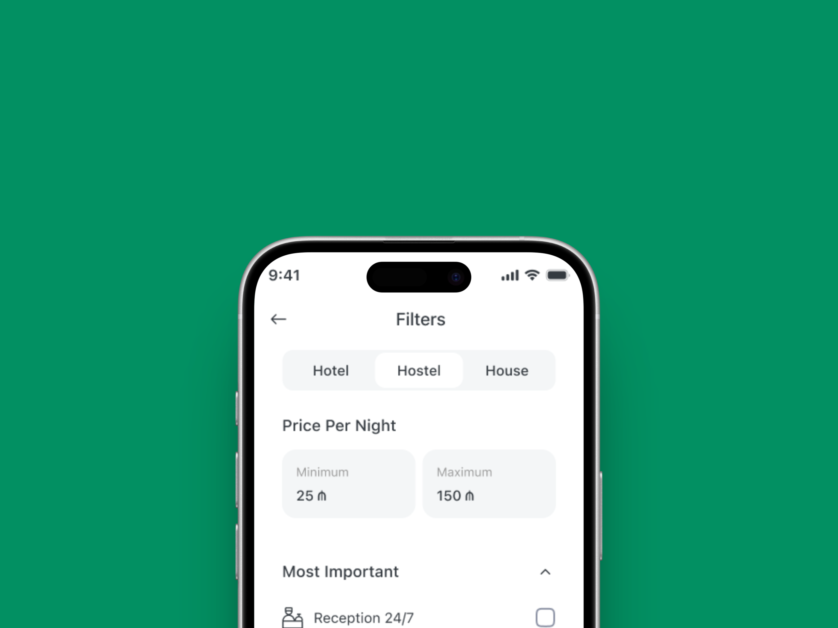
The App Bar is a top-level navigation and contextual information component. It provides page titles, back navigation, filtering, and optional trailing actions (e.g., search or settings). It ensures consistent navigation patterns across the application and improves user orientation.
Variants & states
Variants
-
Default: Basic title with optional filter buttons.
-
Large text: Prominent page title variant.
-
Search / search alternative: Replaces the title with a search input field.
-
Trailing icon 1 / 2: Includes one or two action icons on the right side.
-
Show filter button: Includes filter toggle button.
-
Show title with input: Combines title and inline input field.
States
-
Default state: Idle, showing standard page context.
-
Scrolled state: Compact appearance after content scroll.
-
Active filter state: Highlighted filter button when active.
Anatomy
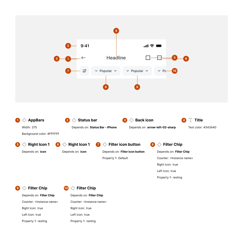
Key elements:
-
Status bar – Displays system time and indicators.
-
Back button – Navigates to previous screen.
-
Page title – Indicates current screen.
-
Search field – Optional input replacing title.
-
Filter buttons – Quick filter dropdowns or toggles.
-
Trailing actions – Optional actions (e.g., settings, close).
Usage guidelines
Do ✅
-
Keep the title short and descriptive of the page.
-
Use back button only when there is a valid previous context.
-
Apply filters consistently for content-driven pages.
Don’t ❌
-
Avoid placing too many actions in the App Bar (limit to 2-3).
-
Don’t allow titles to wrap to multiple lines (truncate instead).
-
Avoid inconsistent spacing between filters and trailing icons.