Cards
Description
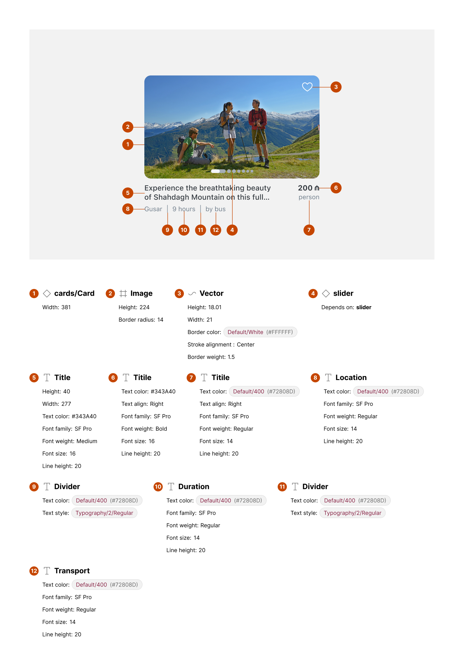
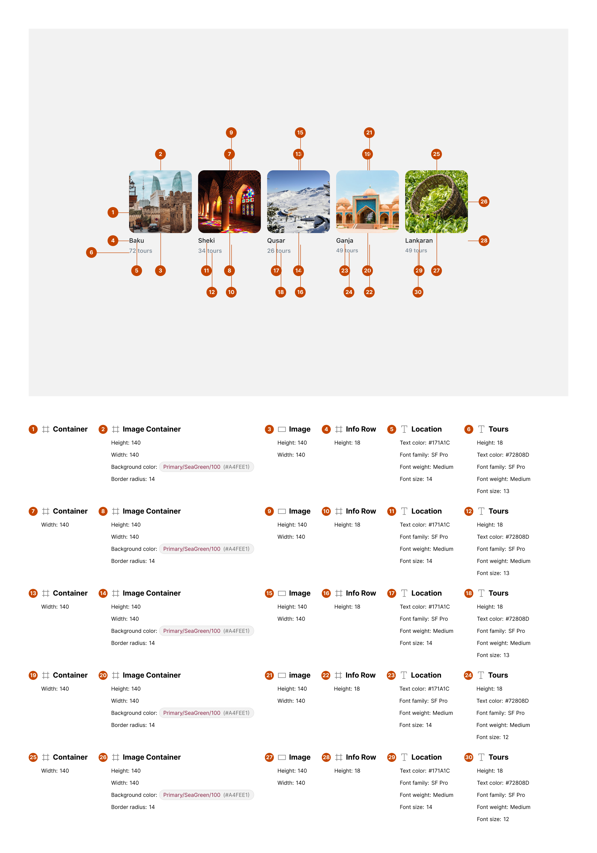
Cards are used to group related content and actions about a single subject. In this layout, they showcase destinations, hotels, tours, and promotions with visual emphasis on images, titles, and supporting metadata.
Variants & states
Variants
-
Destination card: Image with title and tour count.
-
Hotel card: Image with hotel name and count.
-
Promotion card: Large featured image with overlay text and pricing.
-
Horizontal card: Wide card with descriptive text and metadata.
States
-
Default: Idle state displaying image and text content.
-
Hover/Focus (web): Slight elevation or highlight.
-
Selected (optional): Marked with favorite or active state indicator.
Anatomy
-
Image container:
-
Rounded corners (e.g., 12px radius)
-
Displays destination/hotel visuals
-
-
Title text:
-
Primary label (e.g., city or place name)
-
Font style: medium weight
-
-
Metadata text:
-
Supporting info (e.g., “72 tours,” “224 hotels”)
-
Font style: smaller body or caption
-
-
Price/Promo badge (optional):
- Positioned top-right for discounts or prices
-
Action icon (optional):
- Favorite/like icon in corner for saving
-
Description (horizontal cards):
- Brief text describing the experience
-
Supporting metadata (horizontal cards):
- Duration, transportation method, etc.
Layout and spacing

-
Direction: Vertical (grid) or horizontal (carousel)
-
Padding: 8–16px inside card edges
-
Spacing between elements: 4–8px (title ↔ metadata)
-
Grid alignment: Equal height cards for uniform appearance
Usage guidelines
Do ✅
-
Use high-quality images relevant to the content.
-
Keep metadata concise (e.g., tour count, price).
-
Maintain consistent card sizes in the same layout.
Don’t ❌
-
Don’t overcrowd cards with too much text or multiple CTAs.
-
Avoid inconsistent border radii or image ratios.
-
Don’t mix unrelated content types in one card set.