Buttons
Description
The button is a fundamental interactive component used to trigger actions across the interface. It ensures consistent interaction patterns for primary and secondary actions, supports various states and sizes, and accommodates icons for better context.
Variants & States
Variants
-
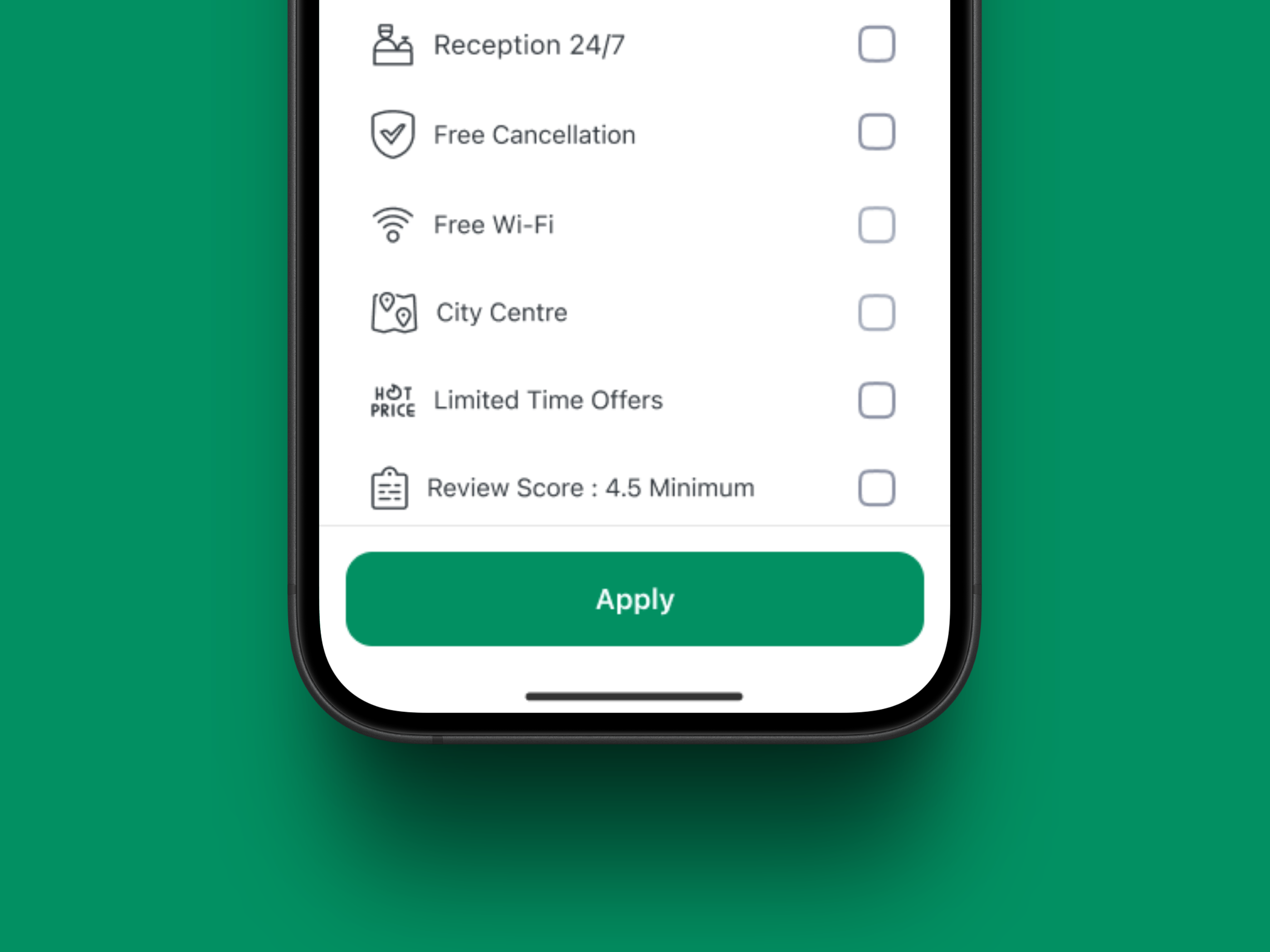
Primary – Used for main actions (e.g., submit forms, confirm actions).
-
Secondary – Used for supporting or alternative actions.
-
Text – Minimal style for less prominent actions, often inline with content.
States
-
Default – Ready for user interaction.
-
Pressed – Indicates active engagement during click/tap.
-
Disabled – Non-interactive state; action unavailable.
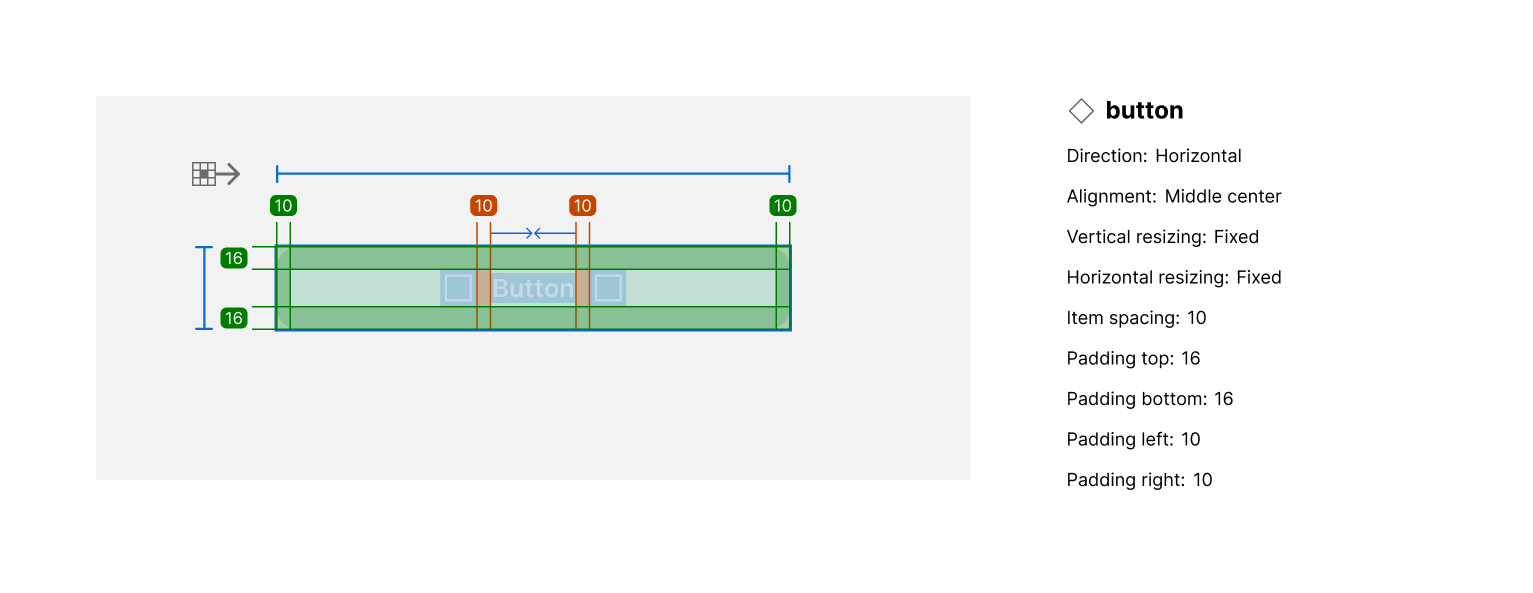
Anatomy
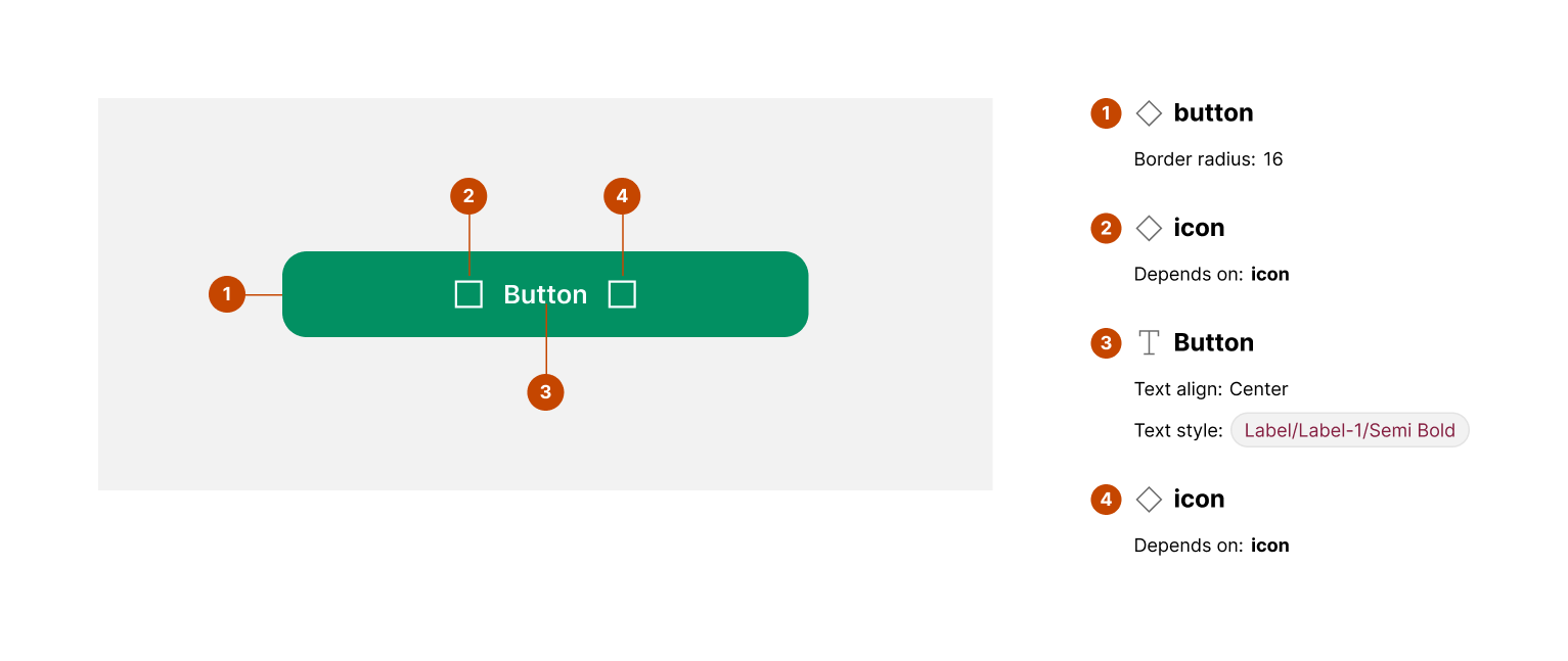
Elements:
-
Button container – Defines the clickable area and background.
-
Label – The button’s text, indicating the action.
-
Icon (optional) – Can be placed left or right to complement the label.
Key attributes:
-
Padding and spacing are consistent across sizes.
-
Border radius: 8px (2XL).
-
Typography: Medium weight for label text.
-
Icon spacing aligned with text baseline.
Properties
Size
-
Large: Height 56px
-
Medium: Height 52px
Type
-
Primary: Background #008552, Text #FFFFFF
-
Secondary: Background #A3DD58, Text #4D4D4D
-
Text: No background, Text #4D4D4D
Usage Guidelines
✅ Do:
-
Use primary buttons for the most important actions on a screen.
-
Place icons when actions need additional context (e.g., Download, Add).
-
Maintain consistent spacing and alignment across screen sizes.
❌ Don’t:
-
Use multiple primary buttons on a single screen.
-
Overuse secondary or text buttons in areas requiring strong emphasis.
-
Mix icon positions inconsistently.