Stepper
Description
The Stepper component visually represents progress through a multi-step process. It guides users through sequential tasks, indicating the current step, completed steps, and upcoming steps with distinct visual states.
Variants & states
Variants
-
Horizontal stepper: Steps aligned in a row (default).
-
Vertical stepper: Steps stacked vertically for mobile or compact layouts.
States
-
Active: Highlighted current step with distinct color and icon state.
-
Completed: Steps visually marked as done (often filled or with checkmark).
-
Disabled: Future steps not yet available for interaction.
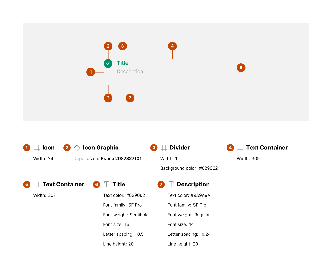
Anatomy
-
Icon (step indicator):
-
Width: 24px
-
Indicates step state (active, completed, or disabled)
-
-
Icon graphic:
- Dependent on state (active/completed icons)
-
Divider (line between steps):
-
Width: 8px
-
Color: #D2D2D2 (default)
-
-
Text container:
- Holds step title and description
-
Title:
-
Text color: #262626
-
Font weight: SemiBold
-
Font size: 16px
-
-
Description (optional):
-
Text color: #8B8B8B
-
Font weight: Regular
-
Font size: 14px
-
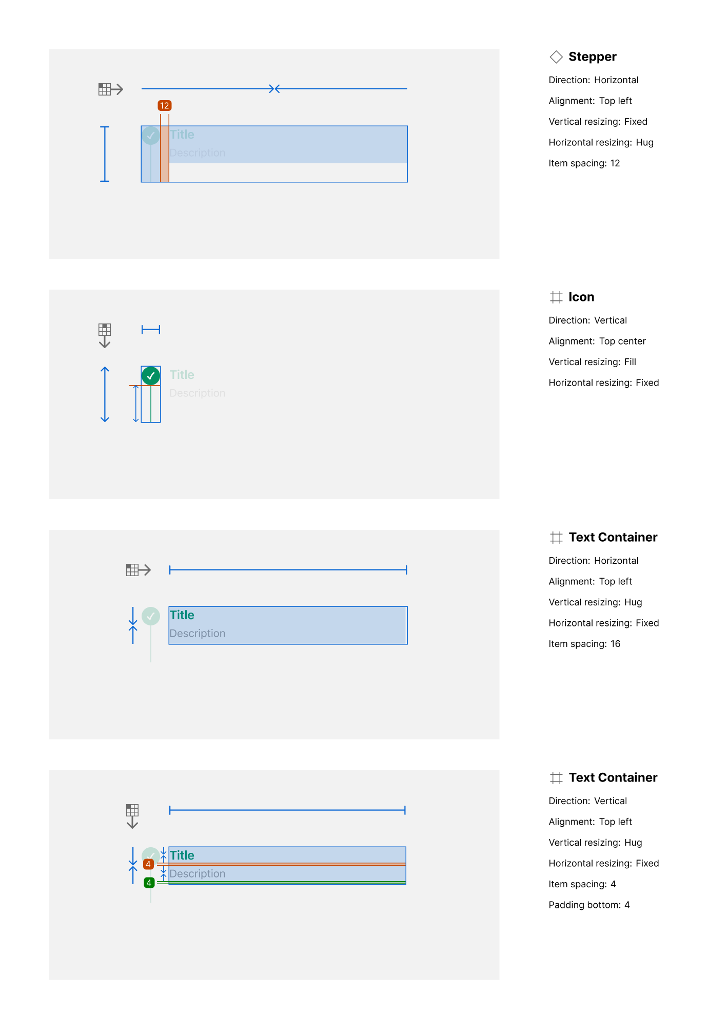
Layout and spacing
-
Stepper container:
-
Direction: Horizontal
-
Alignment: Top center
-
Vertical resizing: Fixed
-
Horizontal resizing: Hug content
-
Item spacing: 12px
-
-
Text container:
-
Horizontal padding: 4px bottom padding (for description)
-
Item spacing between title and description: 16px
-
Usage guidelines
Do ✅
-
Use to indicate progress through a sequence of steps (e.g., onboarding, checkout).
-
Clearly distinguish between active, completed, and upcoming steps.
-
Provide short, meaningful step titles and concise descriptions.
Don’t ❌
-
Don’t overload with too many steps (keep it concise and scannable).
-
Avoid unclear visual differentiation between active and inactive steps.
-
Don’t use stepper when process flow is non-linear or optional.