Navbar
Description
The Navigation Bar is a fixed bottom navigation component providing quick access to key sections of the application. It accommodates multiple menu items, including a central action (e.g., home or primary feature) and integrates seamlessly with system indicators such as the iPhone Home Indicator.
Variants & states
Variants
-
Default: 4–5 menu items with icons only.
-
With central highlight: Emphasized middle item (e.g., floating or active state).
-
With labels (optional): Icons accompanied by text labels for clarity.
States
-
Default: Idle icons representing inactive sections.
-
Selected: Active icon or highlighted state for the current section.
-
Disabled: Muted icon for unavailable features.
Anatomy
-
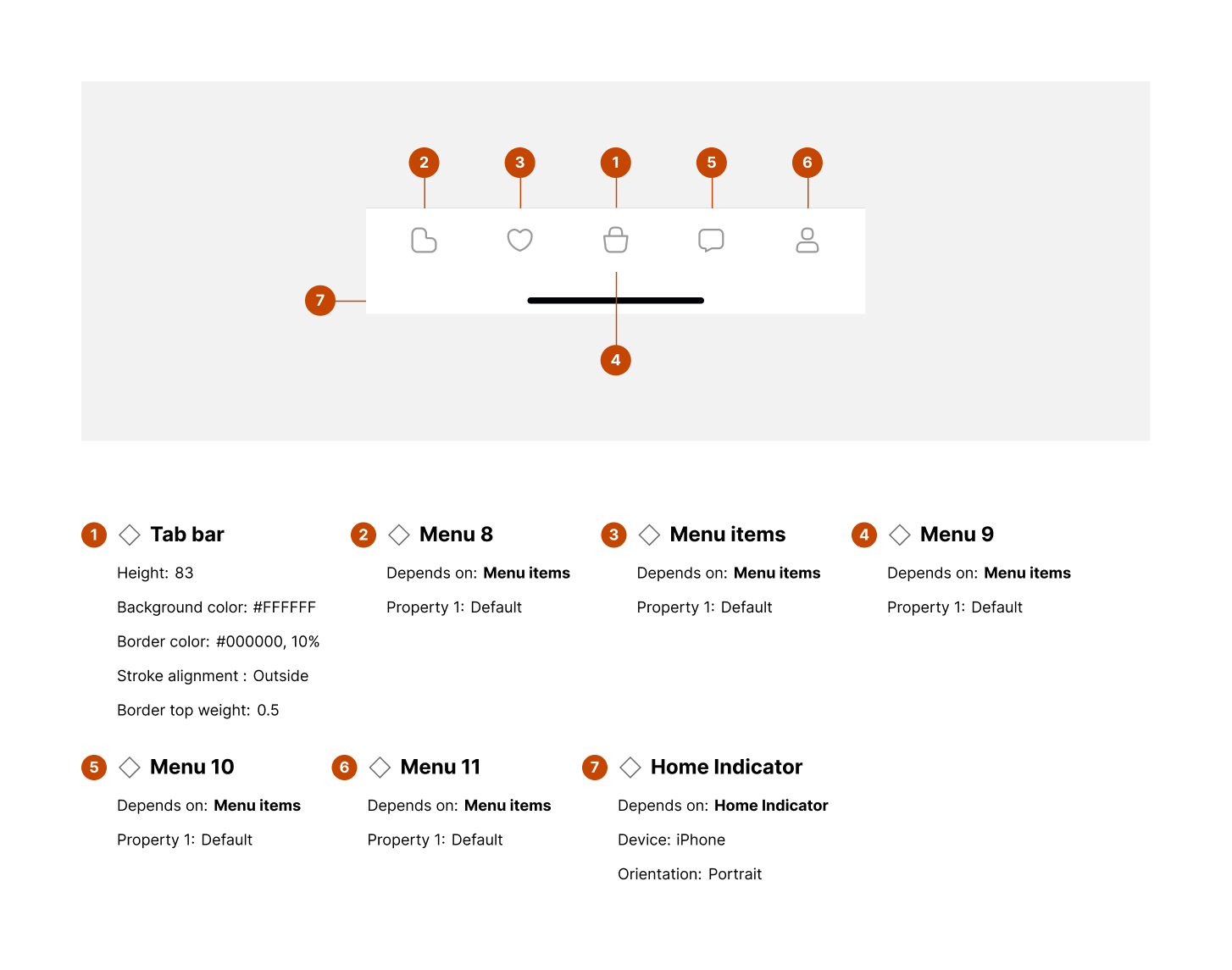
Tab bar:
-
Height: 83px
-
Background color: #FFFFFF
-
Border color: #000000 (10% opacity)
-
Border top weight: 0.5px
-
-
Menu items (2–6):
-
Depends on menu properties (default variant shown)
-
Horizontal arrangement with equal spacing
-
-
Home indicator:
-
Device: iPhone
-
Orientation: Portrait
-
Positioned below the tab bar for gesture navigation
-
Layout and spacing
-
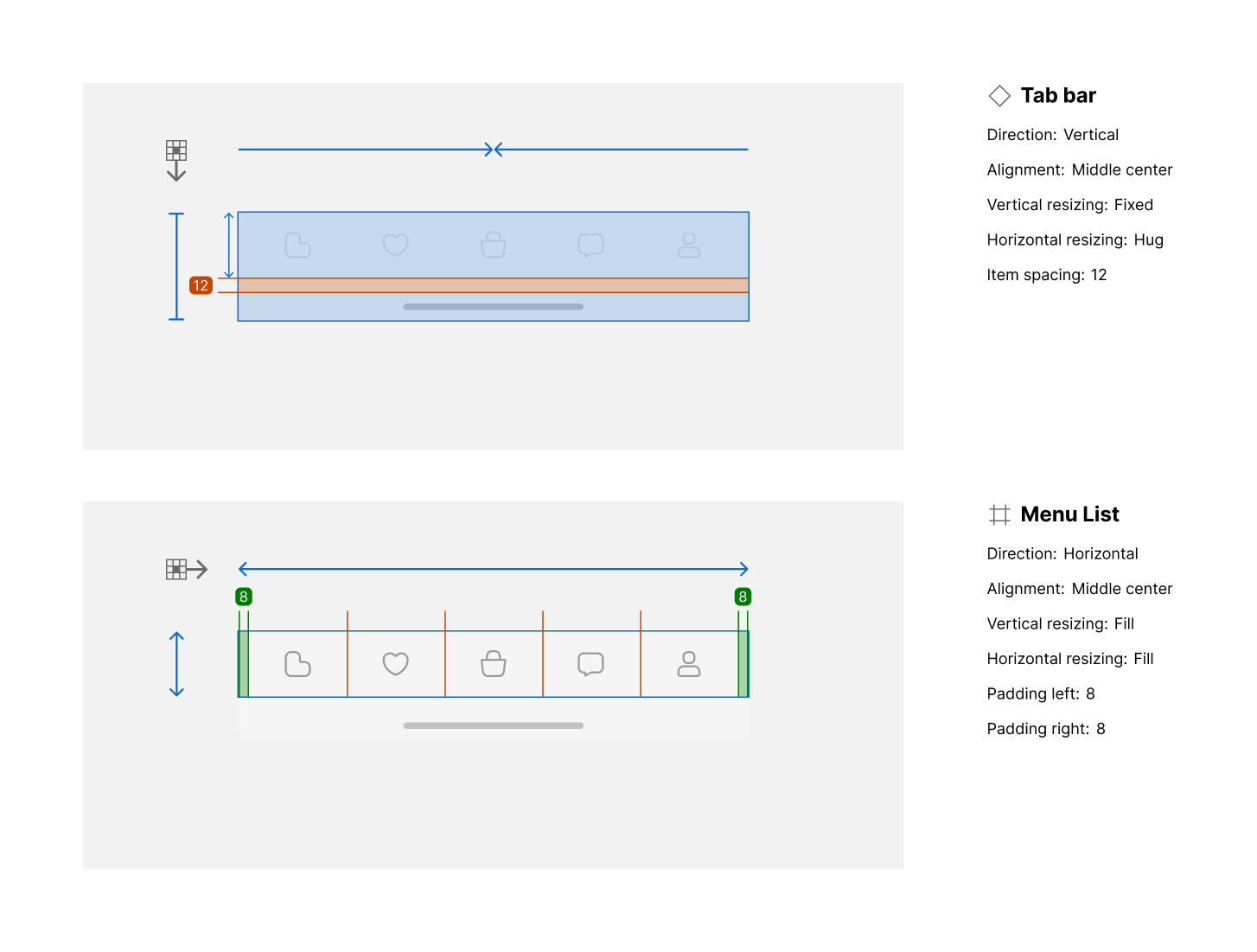
Tab bar container:
-
Direction: Vertical
-
Alignment: Center
-
Vertical resizing: Fixed
-
Horizontal resizing: Hug content
-
Item spacing: 12px
-
-
Menu list:
-
Direction: Horizontal
-
Alignment: Center
-
Vertical resizing: Fill
-
Horizontal resizing: Fill
-
Padding left/right: 8px
-
Usage guidelines
Do ✅
-
Use consistent iconography for menu items across screens.
-
Limit the number of menu items to 3–5 for clarity.
-
Highlight the current section to provide clear feedback.
Don’t ❌
-
Avoid using the Navigation Bar for secondary actions.
-
Don’t mix inconsistent icon sizes or styles.
-
Avoid overcrowding the bar with excessive items or text.