Inputs
Description
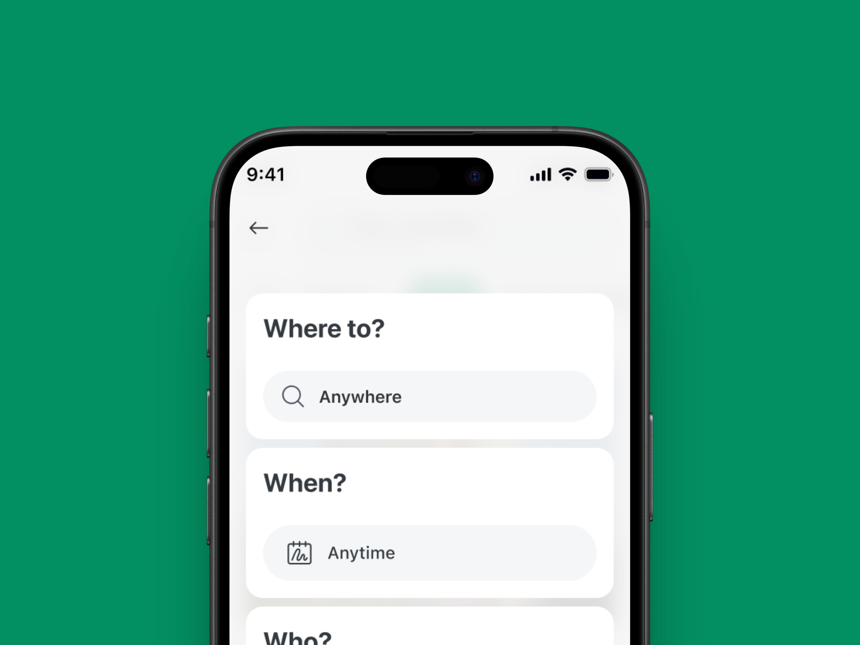
The Input Button component combines text input with optional left/right icons and support text. It is primarily used for search, filter, or quick input fields within forms or toolbars, providing a compact and visually balanced structure.
Variants & states
Variants
-
Default: Basic input field without icons.
-
With left icon: Includes leading icon (e.g., search).
-
With right icon: Includes trailing icon (e.g., clear or action).
-
With support text: Displays helper or validation text beneath.
States
-
Default: Idle input state.
-
Focused: Highlighted border to indicate active input.
-
Filled: Displays user-entered text.
-
Error / Validation: Shows error or support text when applicable.
-
Disabled: Reduced opacity and interaction disabled.
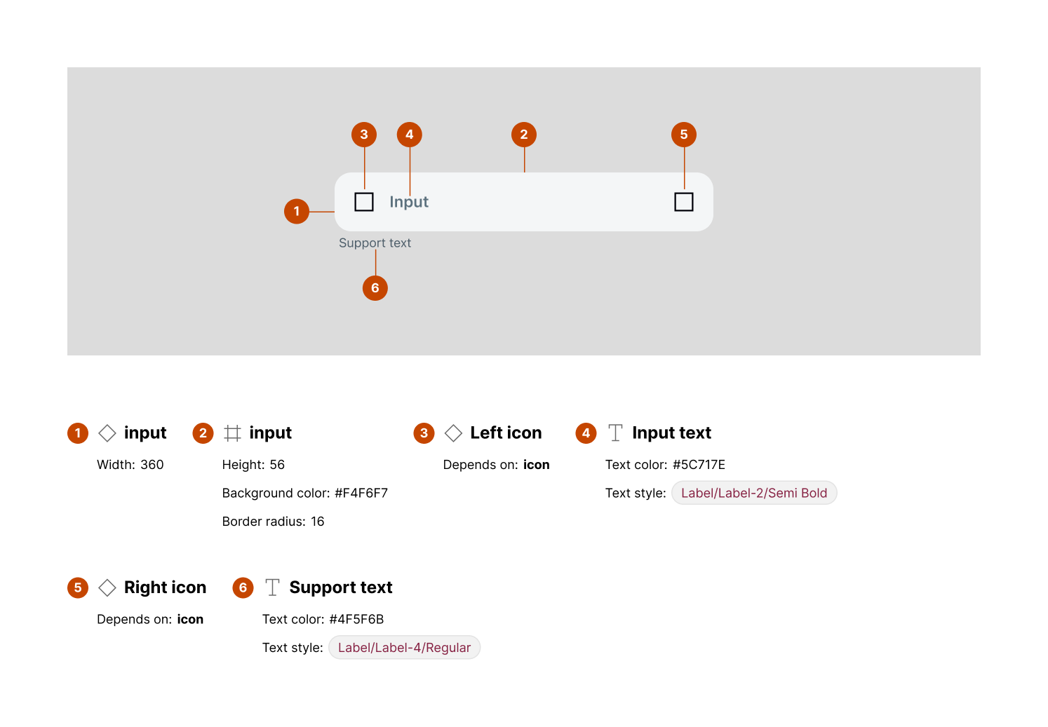
Anatomy
-
Input container – Width: 360px, Height: 56px, Background color:
#F4F6F7, Border radius: 16px -
Left icon (optional) – Depends on icon usage, typically indicates input purpose
-
Input text – Text color:
#5C717E, Text style:Label/Label-2/Semi Bold -
Right icon (optional) – Depends on icon usage, typically for actions like clear or confirm
-
Support text – Text color:
#4F5F6B, Text style:Label/Label-4/Regular
Usage guidelines
Do ✅
-
Use support text for hints, helper messages, or validation feedback.
-
Keep icons meaningful (e.g., search, clear, dropdown indicator).
-
Ensure sufficient contrast between input text and background.
Don’t ❌
-
Avoid cluttering with both left and right icons unless necessary.
-
Don’t exceed one line for support text (truncate if needed).
-
Avoid using the input for non-interactive content.