Dialog
Description
The Dialog is a modal component used to display critical information, confirmations, or user actions that require focused attention. It overlays the main content, preventing interaction with the rest of the interface until dismissed or an action is taken.
Variants & states
Variants
-
Default: Title with description and primary action.
-
With body text: Includes additional descriptive content.
-
With icon: Displays an icon at the top for emphasis (e.g., success, warning).
-
With close icon: Adds dismiss option via close button.
-
With input field: Supports data entry directly in the dialog.
States
-
Default: Idle state with actions enabled.
-
Focused: When input is active (for variants with text fields).
-
Disabled actions: When required conditions are not met (e.g., empty input).
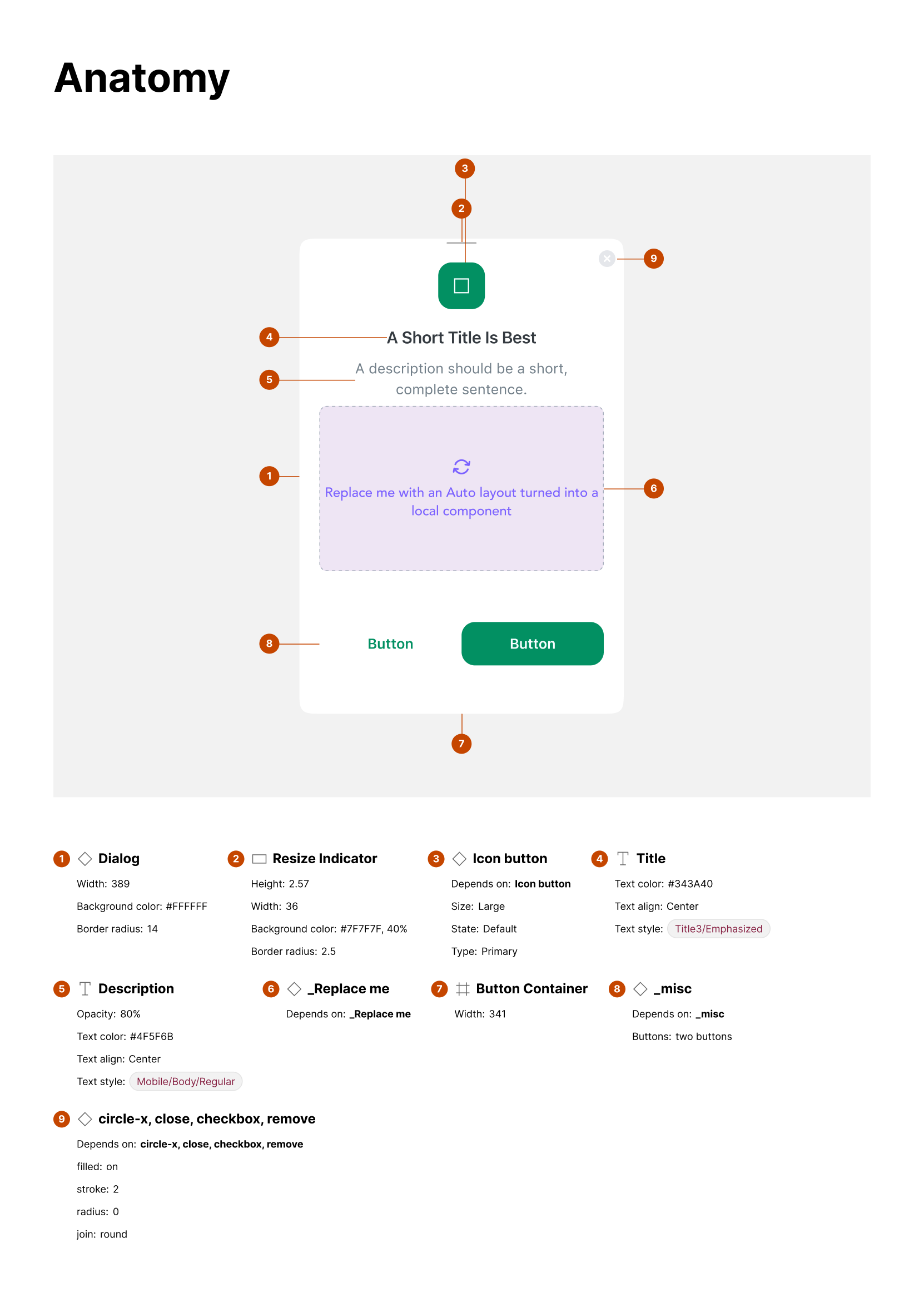
Anatomy
-
Dialog container:
-
Width: variable (responsive)
-
Background color: #FFFFFF
-
Border radius: 16px
-
Elevation/shadow for modal effect
-
-
Icon (optional):
-
Positioned at top center
-
Indicates dialog type (info, success, warning)
-
-
Title:
-
Text style: Heading/Heading-3/Semi Bold
-
Color: primary text color
-
-
Body text (optional):
-
Text style: Body/Body-2/Regular
-
Used for additional details
-
-
Input field (optional):
- For user input in specific dialogs
-
Action buttons:
-
Primary and/or secondary actions
-
Aligned center or right
-
-
Close icon (optional):
- Positioned top-right for dismissing dialog
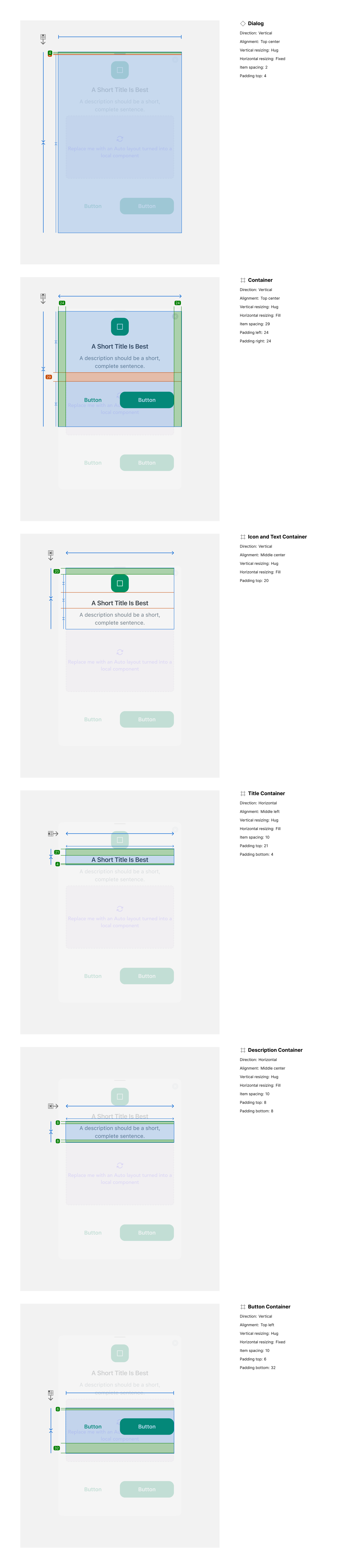
Layout and spacing
-
Direction: Vertical stacking of elements
-
Alignment: Centered content horizontally
-
Spacing:
-
Icon to title: 16px
-
Title to body text: 8px
-
Body text to input: 12px
-
Input to actions: 16px
-
-
Padding:
- 24px horizontal, 32px vertical (container padding)
Usage guidelines
Do ✅
-
Use dialogs for critical actions requiring explicit user acknowledgment.
-
Keep titles short and descriptive.
-
Use primary actions for the most important tasks (e.g., “Confirm,” “Save”).
Don’t ❌
-
Don’t overload the dialog with too much content — keep it focused.
-
Avoid stacking multiple dialogs; use a single modal at a time.
-
Don’t use dialogs for non-blocking information (use banners or toasts instead).